Property managers told us Ignite's mobile app was "nowhere near" the web experience, resulting in 62% fewer users than the web audience. Constrained by resources, I hypothesised that shipping features iteratively, rather than attempting feature parity, would prove value most efficiently. By designing and shipping three focused releases based on property managers' on-the-go needs, we reduced app abandonment from 64% to 31%, creating opportunities for the business to convert more customers to paid Ignite subscriptions.
The business problem: Mobile users were abandoning the app for web
Ignite is REA's estate agency and property listings management platform, serving customers through a web interface and across iOS and Android platforms. The web platform, while being newer, is more feature-rich than the app's offering.
The business goal was to increase monthly active users, enabling more opportunities to drive higher-tier subscription growth. With competitors developing strong native solutions in the mobile space, REA was keen to expand Ignite's features across native surfaces. Mixpanel analytics indicated that property managers made up the largest segment of the app's audience. We decided that by addressing their needs first, we could increase monthly active users by the biggest margin.
What we discovered: Property managers needed tools that reassured their clients
Interviews with property managers revealed that customers rely on Ignite's data to position themselves as experts in the eyes of their clients.
[I want to have] access to applications on the go to see how many applied and to get an overview to communicate back to the landlord.
While we knew customers used Ignite on the go to stay on top of their workloads, we had underestimated just how vital our tools were to support face-to-face client interactions.
What I hate is the app. It’s nowhere near where the web platform is. I was with a client and I was like, "you have to see how good this is from a [rental] application perspective… oh, you can’t see that here."
This quote crystallised the problem: property managers were abandoning the app in favour of the web platform because it lacked the information they needed to confidently answer landlord questions on the go.
My approach: Validate value incrementally with measurable abandonment metrics
The app team's limited resources meant we couldn't build full feature parity with the web platform in one go. Instead, I advocated for an iterative release strategy that would allow us to validate value incrementally while learning from user behaviour.
This meant we would prioritise the most critical jobs-to-be-done for property managers on the go, delivering them in focused releases. Each release would be designed to address specific user needs, allowing us to gather feedback and measure success before moving on to the next set of features.
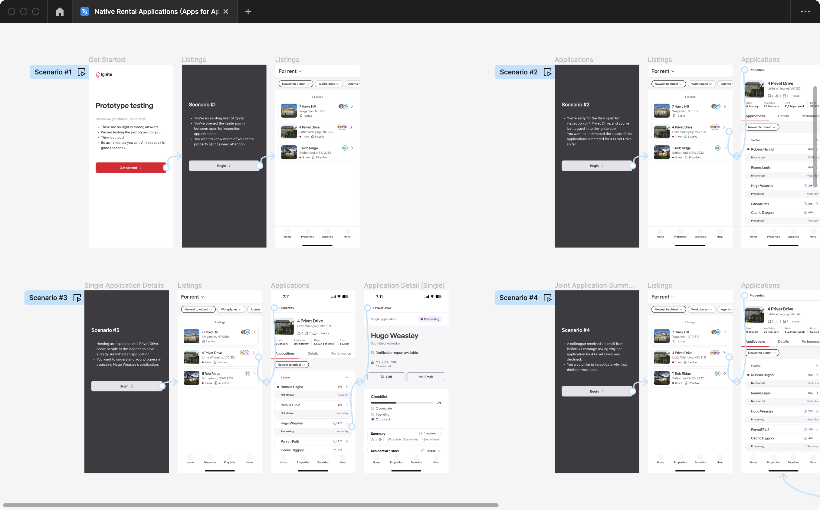
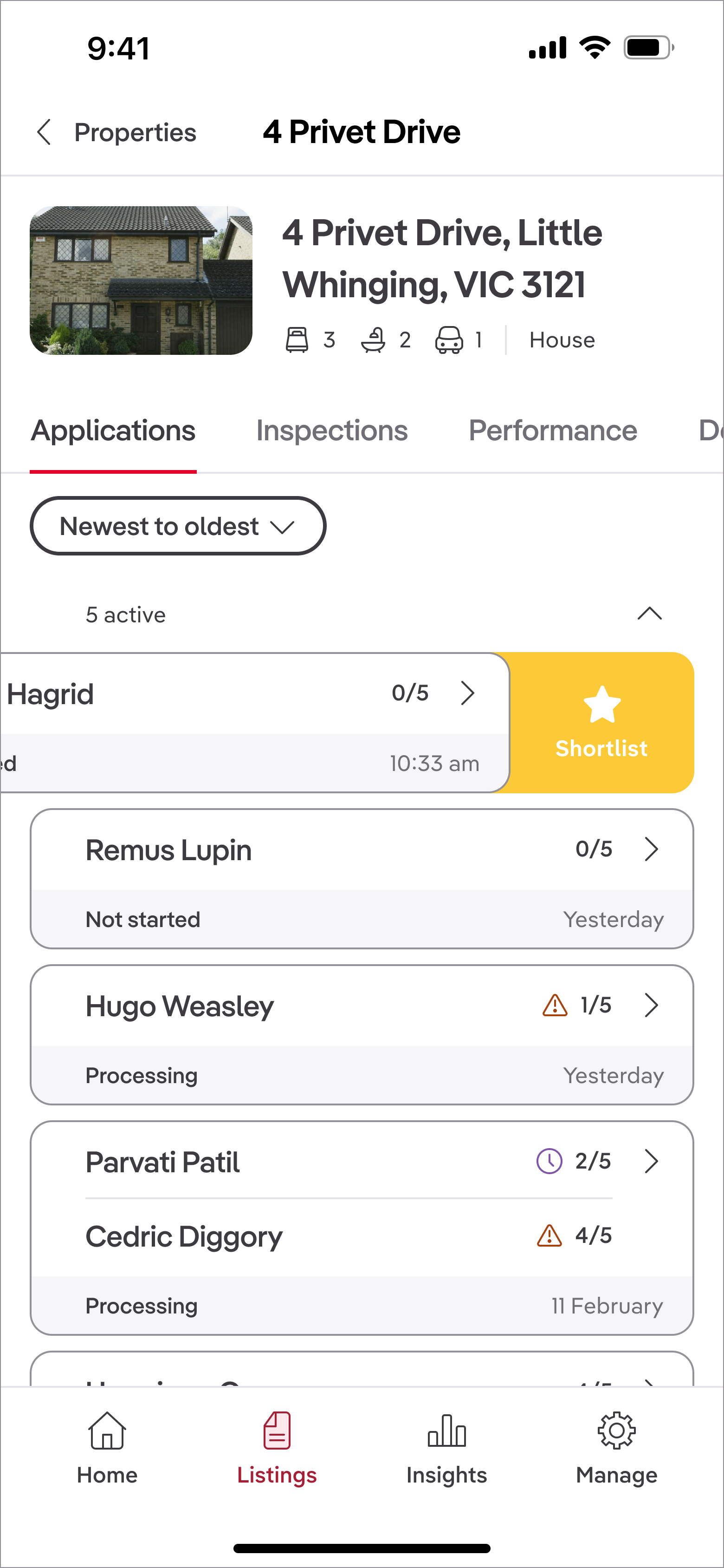
Release 1: Proving demand with application summaries
Aligning the team on jobs-to-be-done
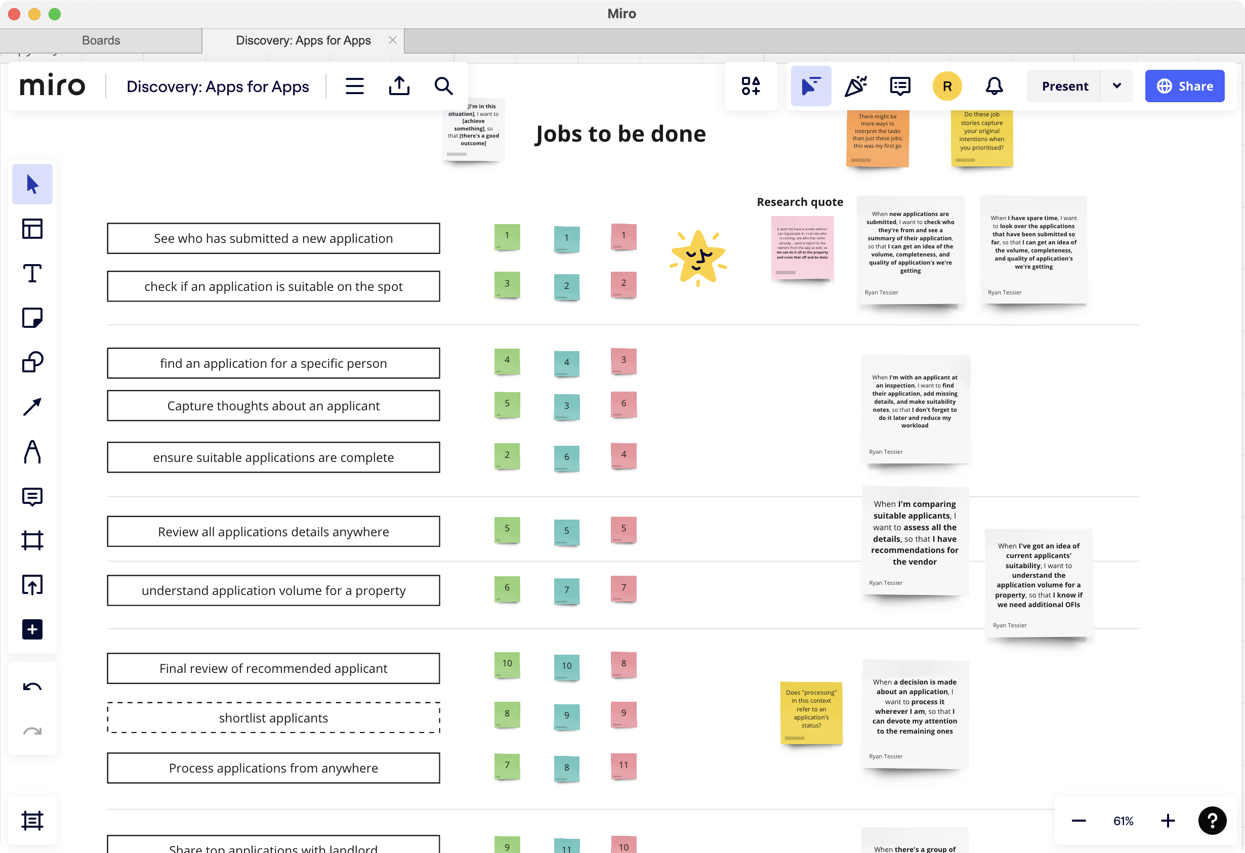
During research, we idenfied key jobs-to-be-done for property managers on the go.
Then, I faciliated a jobs-to-be-done workshop with product managers, engineers, and designers who had previously worked in the property management space to help us prioritise these jobs based on frequency and context. We used sticky notes to rank each job and discussed their importance in supporting property managers' workflows.
We identified three jobs-to-be-done we wanted to address in our releases:
- Know what my applications pipeline looks like for a specific property
- Review applications for completelenss and suitability
- Shortlist applications that look good for a later decision
Validating with stakeholders and uncovering constraints
I sketched low-fidelity wireframes in Miro to quickly communicate the proposed flow and gather feedback from key stakeholders, including product managers, engineers, and people from our Legal team.
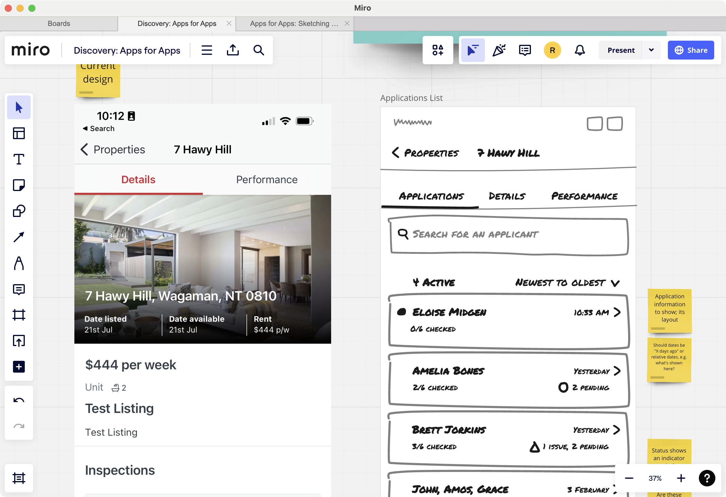
Presenting the designs in a collaborative session, I encouraged stakeholders to annotate the wireframes with their thoughts and concerns. The yellow sticky notes represented outstanding questions, while the orange ones pointed out design rationales.
The feedback challenged a couple of design assumptions:
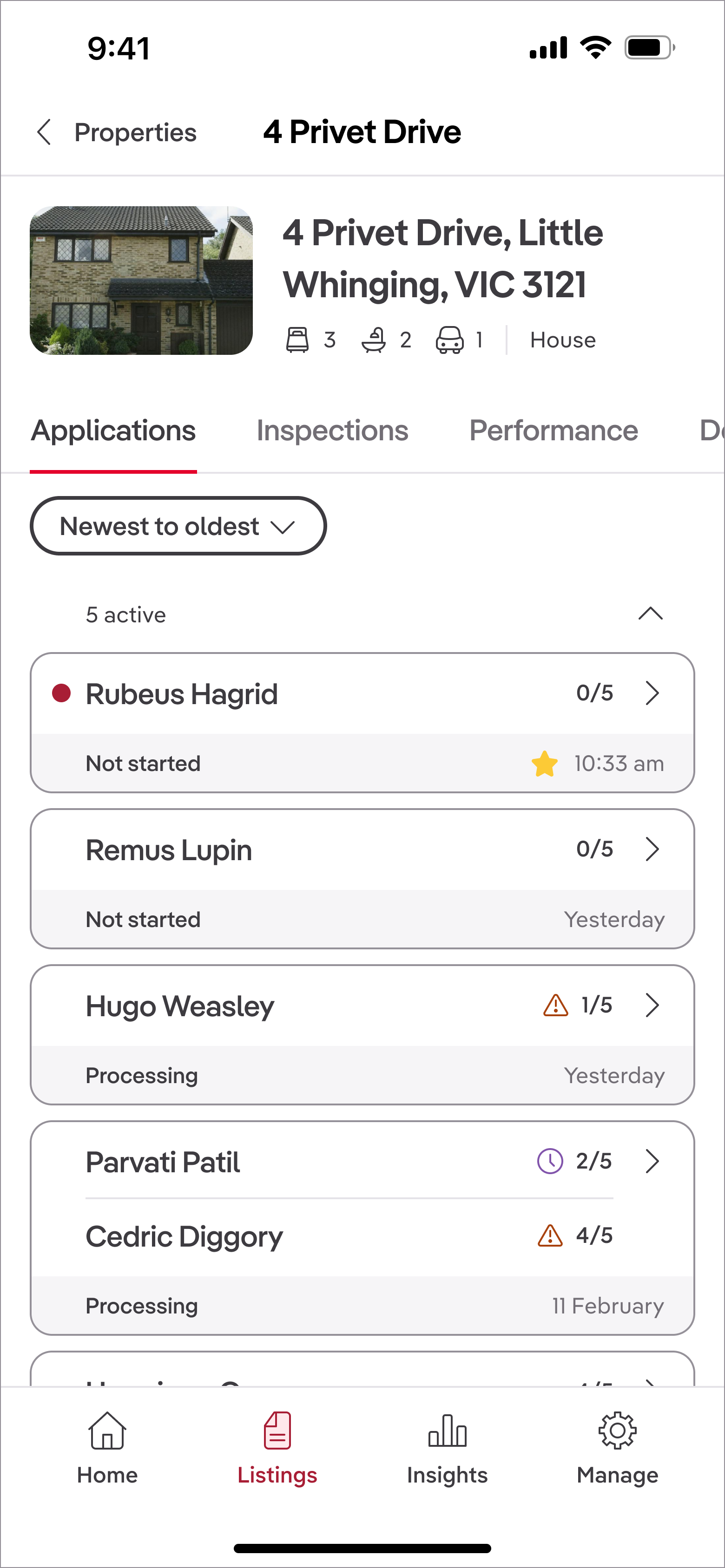
- Privacy concerns: Our Legal team raised concerns about allowing users to download application data onto their mobile devices, which could lead to data breaches. I facilitated a discussion between Engineering and Legal to find a solution that met privacy requirements while still providing value to users. We decided to remove the download functionality from the mobile app, but ensured that users could still see which ID is provided within the app itself.
- Joint applicants: Product managers highlighted that many rental applications involve multiple applicants, and that our checklist system allows the processing of applicants separately. I pivoted the design to restructure the application cards to display joint applicants side by side, ensuring clarity of status.
Several other suggestions from stakeholders were incorporated, while others were pushed back on to maintain focus on the core user needs. I did this by clearly articulating the rationale behind each design decision and how it aligned with our jobs-to-be-done framework.
Usability testing: What broke and what I changed
Usability testing with six property managers helped validate the design and uncover areas of confusion.
Four scenarios were tested:
- Identifying which properties had new applications
- Quickly understanding the status of the applications for a specific property
- Checking what was missing from an application
- Understanding why an application was declined
What worked well
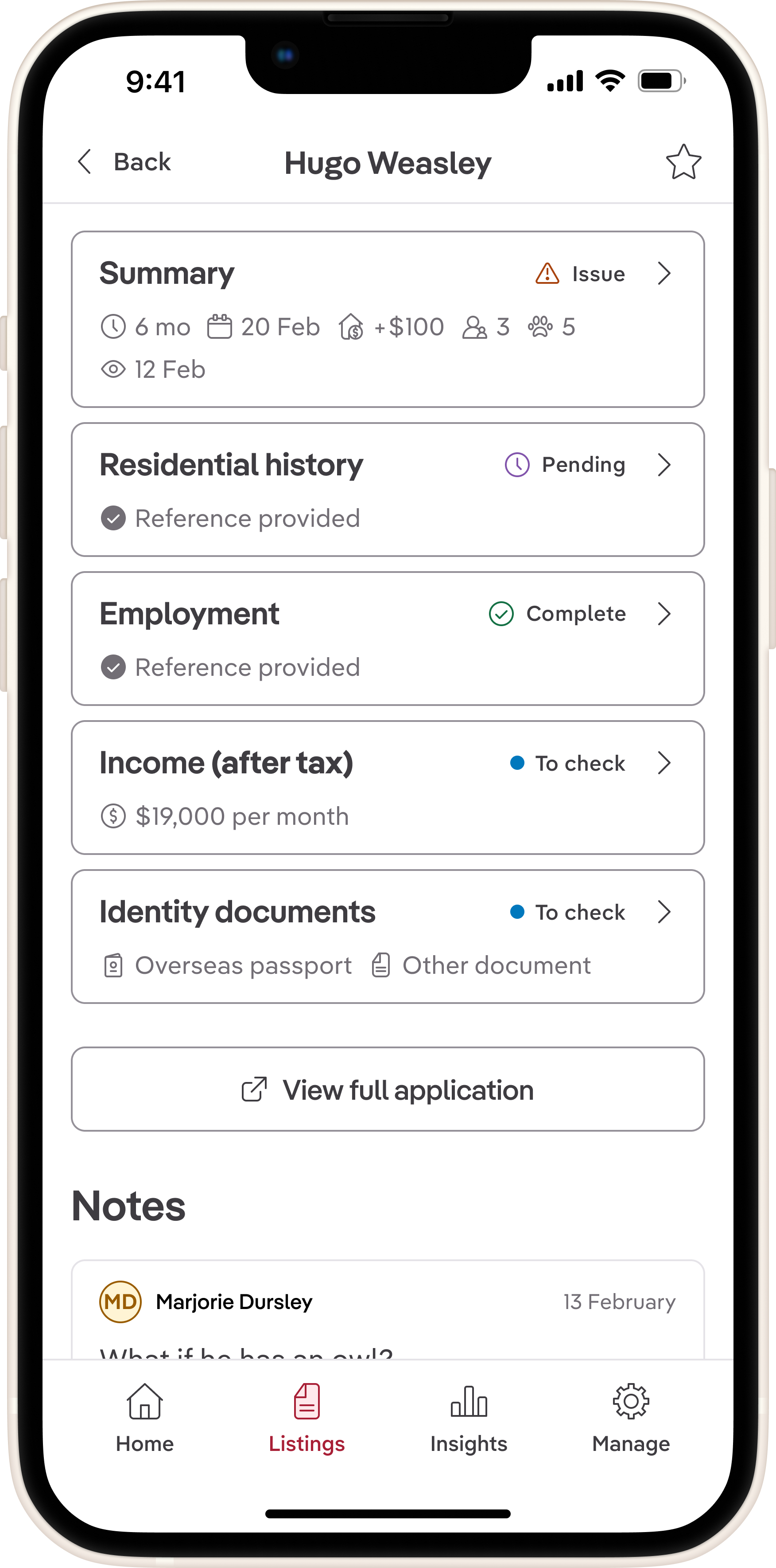
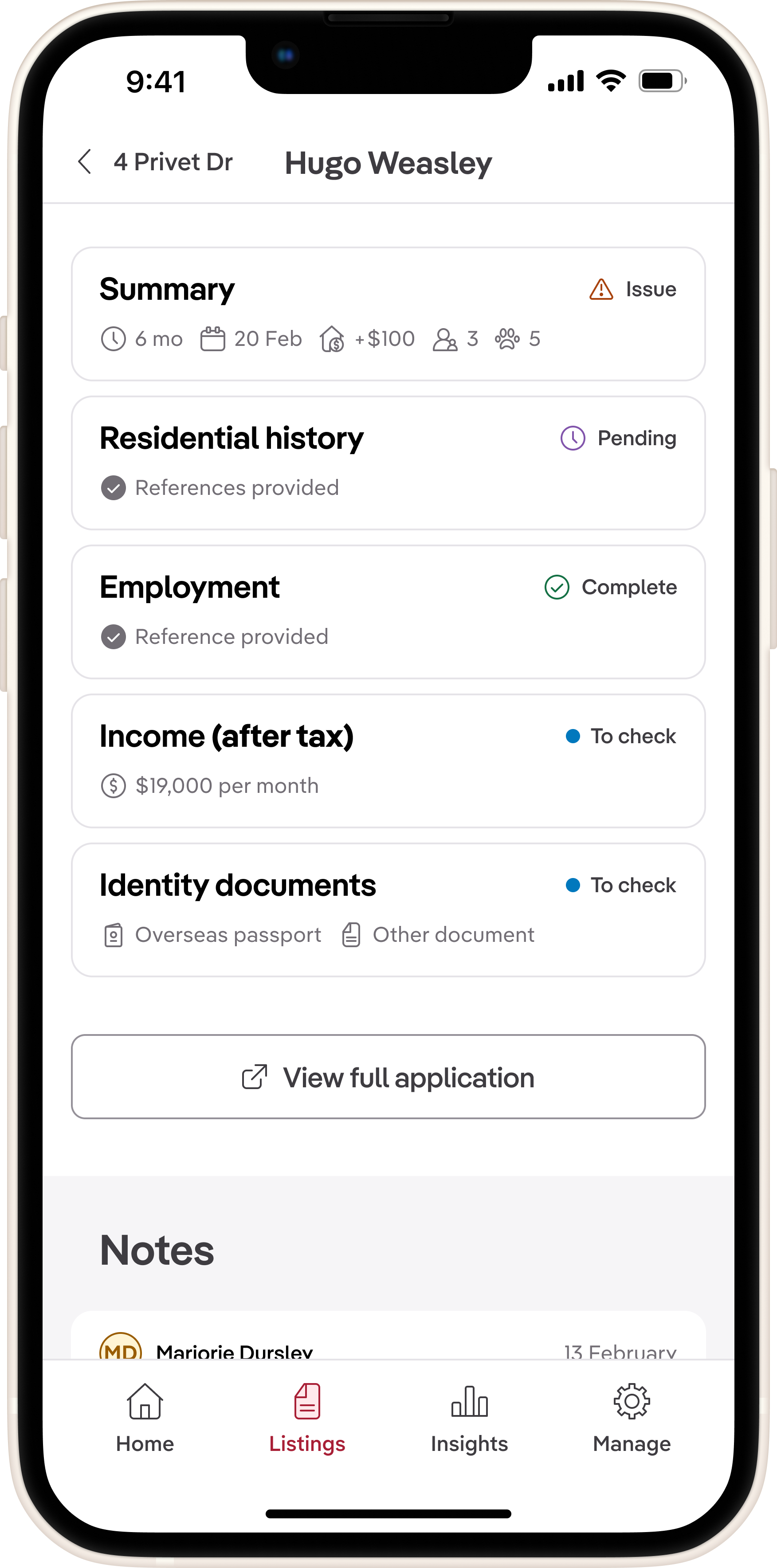
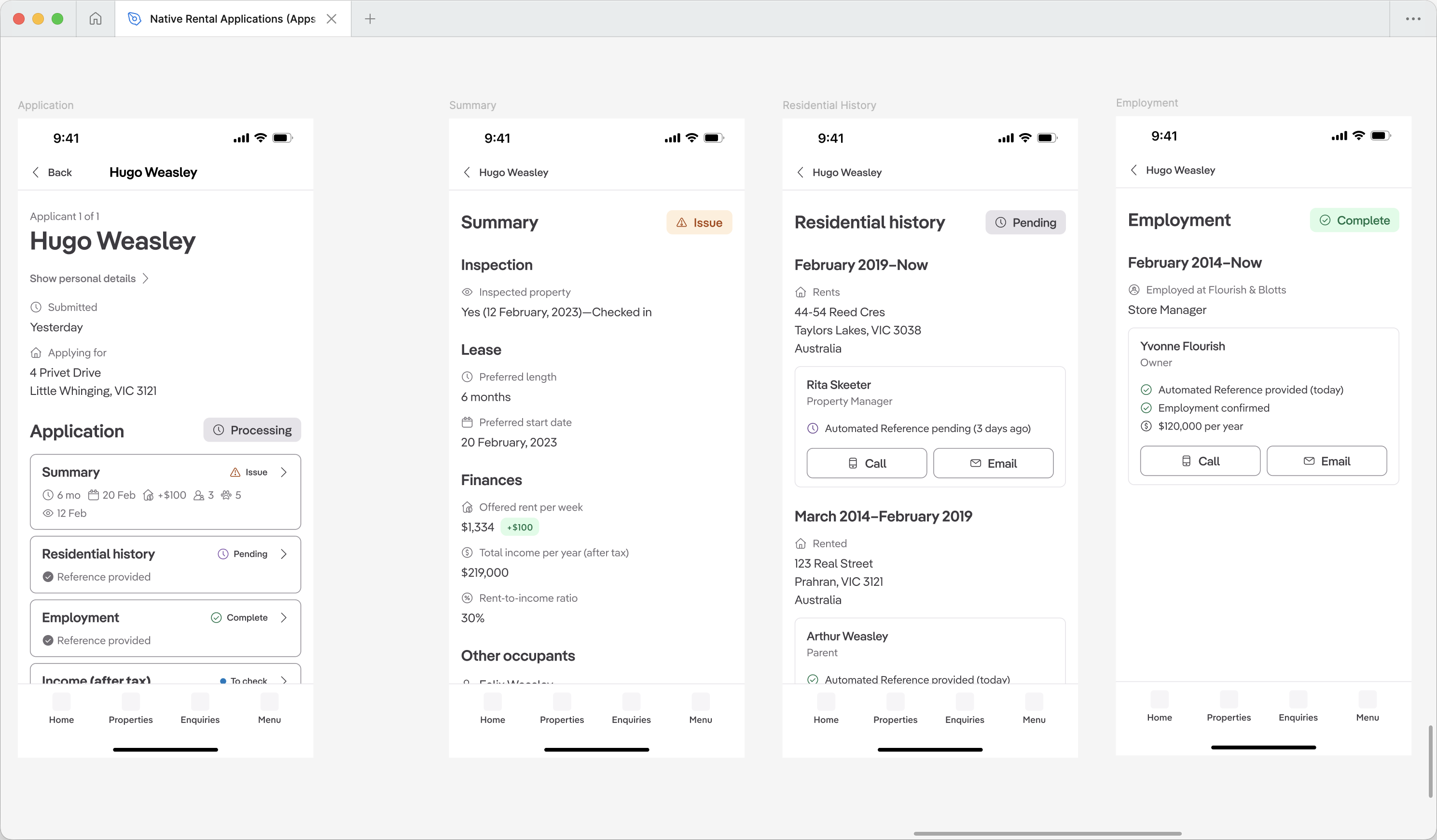
The majority of the design tested successfully. Users loved the joint application summary cards, with one participant noting they "thought everything was pretty well thought out and designed." The red dot clearly signalled unread applications, and the exclamation mark was universally understood as a "red flag."
What confused users
Several key issues emerged that needed immediate attention:
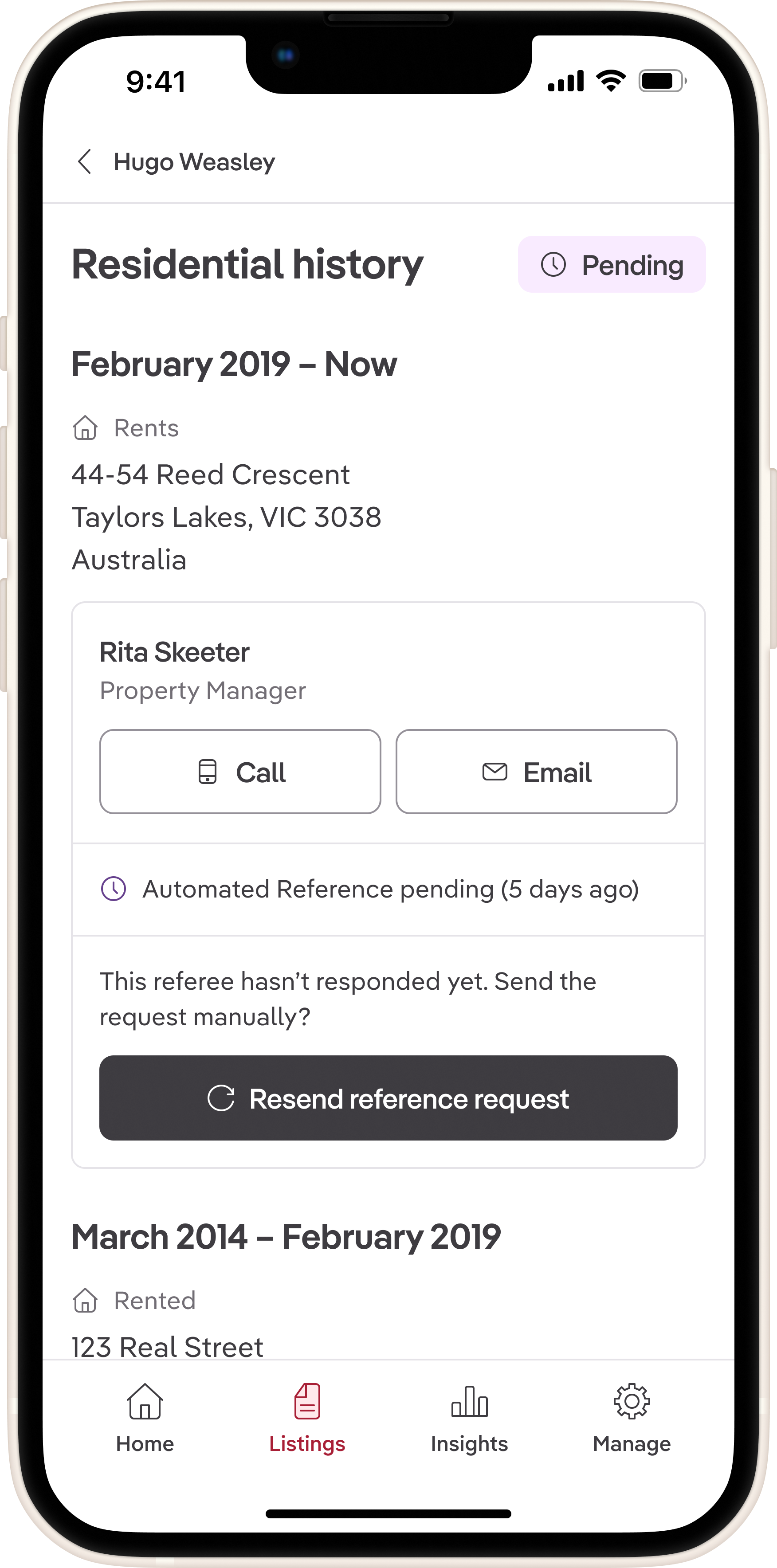
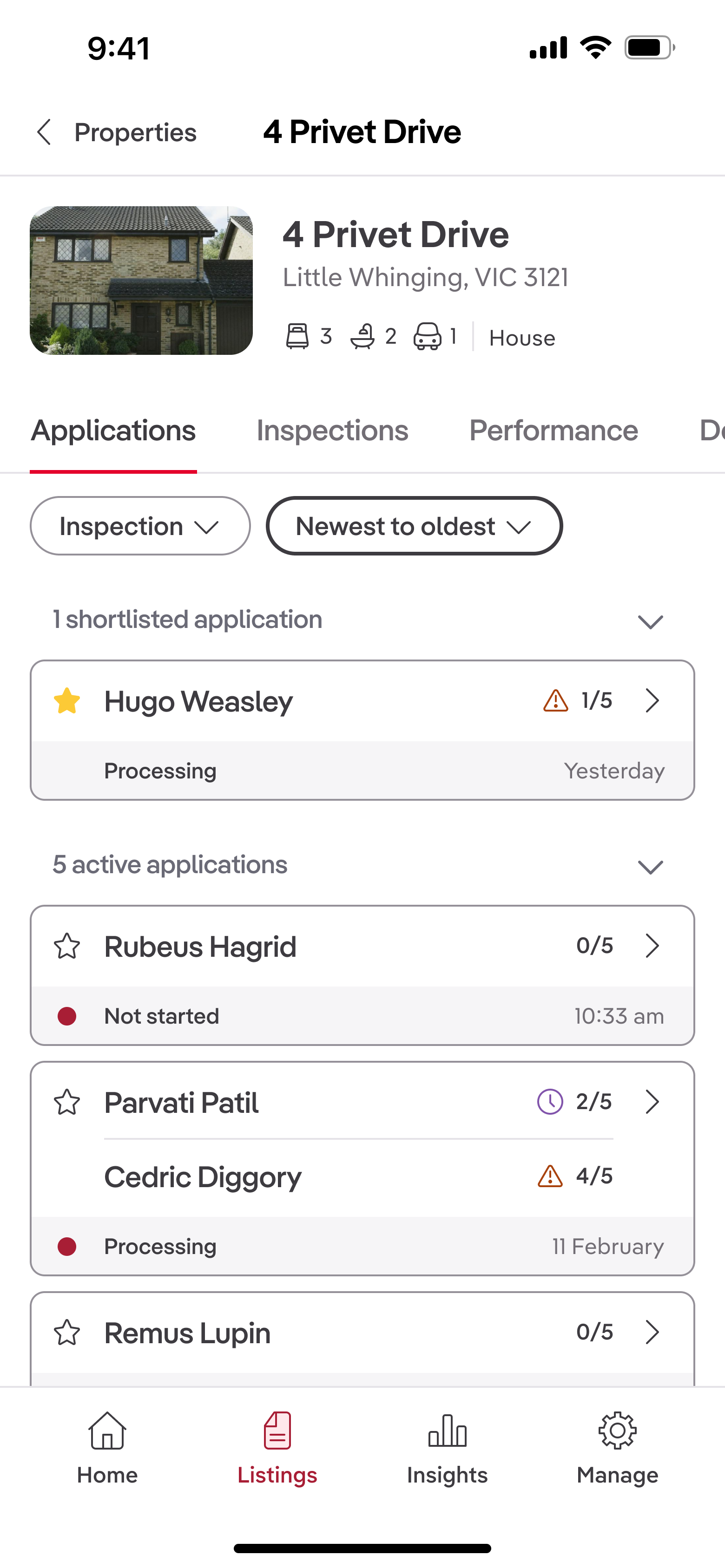
- People expected to see whether references have been confirmed: References were presented with a way to contact referees, but there was no way to see if references had been provided.
- Lack of filtering options: Users wanted to filter applications by status (e.g., new, in progress, declined) to quickly find relevant applications, but this functionality was missing from the design.
- "Open in browser" button copy caused confusion: Several users were unsure what "browser" referred to in the context of the mobile app, leading to hesitation in using the feature.
- Key data points lacked visual prominence: Important information like application dates and applicant counts were not easily scannable, making it harder for users to quickly assess applications.
Changes I made
Based on testing feedback, I made three targeted refinements:
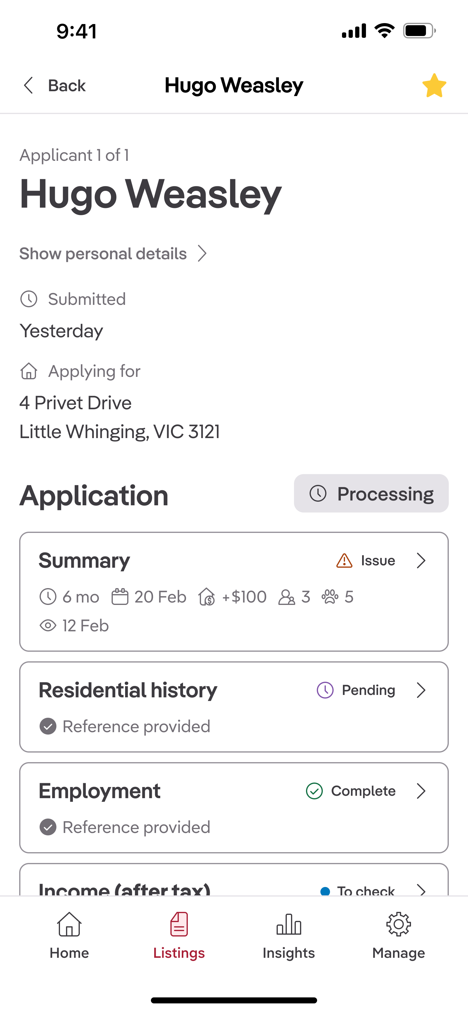
- Added reference statuses to show whether references had been confirmed, providing users with greater clarity on application completeness and prompted action where necessary
- Incorporated filtering options to allow users to sort applications by status, enabling quicker access to relevant applications and improving overall navigation within the app
- Increased visual prominence of key data points like application dates and applicant count, making them more scannable at a glance
- Changed the "Open in browser" button copy to "View full application"—testing revealed users were confused about what "browser" referred to in this context
Chatting with engineers on my team, we assessed the technical feasibility of adding filtering options and reference statuses. Given the tight timeline for Release 1, we decided to defer this feature to a future release, focusing instead on the other high-impact changes.
Shipping with intentional metrics
I worked with my product manager to define our success metric for the feature: abandonment rate, measured by taps on the "View full application" button.
We reasoned that if fewer than 40% of users abandoned to the web, it would indicate that our new feature provided enough value for property managers to stay within the app.
After a couple of sprints, it became clear that the engineering team wouldn't be able to deliver application details in a reasonable amount of time. To keep momentum, I proposed descopeing application details and focusing solely on shipping application summaries with the "View full application" escape hatch.
We shipped the first release with this scope, knowing that it would provide a baseline for measuring user engagement and inform future iterations.
Result: Abandonment rate was 64% in the first month.
While this was higher than our target, it validated that there was demand for mobile application management. The high abandonment rate indicated that users needed more depth to feel confident using the app on the go.
Release 2: Reducing abandonment 23% by adding application details
For the second release, the engineering team was able to deliver application details. I focused on redesigning the navigation to these details based on insights from Release 1.
I wanted to explore how we could better balance breadth and depth, ensuring users could quickly scan applications while still accessing the information they needed.
Design iteration: From accordion to push navigation
The first approach I explored was using expandable sections (accordions) to display application details on a single screen. This would allow users to see all information at once, expanding sections as needed. However, testing revealed that this approach led to long, overwhelming screens that were difficult to scan.
I then sketched two alternative approaches:
- Push navigation into detail screens: This method provided a summary view with the ability to tap into detailed screens for each application section. It maintained context and allowed users to focus on one section at a time.
- Modal overlays: This design used sheets to display section details without navigating away from the summary screen. While it kept users in context, the navigation didn't necessitate a disruption in flow for the completion of a sub-task.
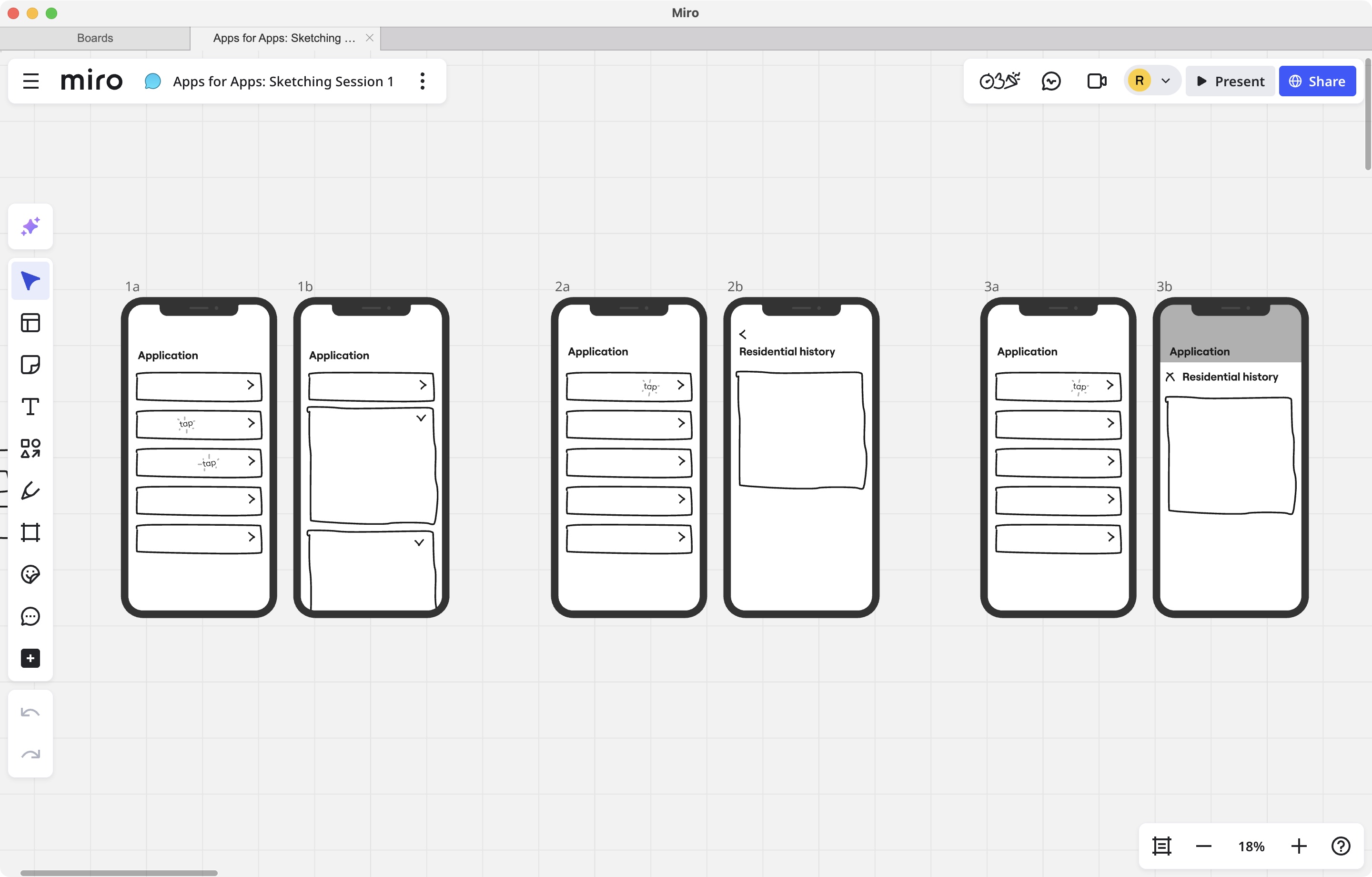
I chose push navigation because it provided a clear hierarchy, allowing users to focus on one section at a time without overwhelming them with information. This approach also aligned well with mobile navigation patterns, making it intuitive for users.
I also requested additional feedback from fellow designers on the visual hierarchy of the screens, and refined the design by increasing spacing between sections and using clearer headers.
Result: Abandonment dropped from 64% to 41% within one month—a 23% improvement.
This significant reduction validated that providing application details met users' expectations, enabling them to stay within the app.
Release 3: Driving engagement with shortlist functionality
Research insight: Property managers triage on mobile, decide at their desk
Going back to our research, we noticed a pattern in how property managers used mobile versus desktop. While they needed to check applications on the go to answer landlord questions, they deferred deeper evaluation and decision-making until they were back at their desks.
This insight revealed an opportunity: if we enabled property managers to shortlist applications on mobile, they could complete a meaningful task during downtime—on the train, between meetings, or waiting for appointments—rather than just passively viewing information.
I hypothesised that adding shortlist functionality would drive longer-term engagement by giving users a reason to return to the app throughout their day, rather than only when prompted by client questions. This aligned with our business goal of increasing monthly active users.
Collaborating with engineering to find a solution
I initially designed swipe-to-shortlist because it felt native and gestural. But pairing with engineers revealed the applications list wasn't built with iOS's native list component, making swipe actions expensive to implement.
Together, we explored alternatives by experimenting with different interaction patterns in code that could achieve the same goal without the technical overhead. We landed on visible star buttons—which were not only faster to ship, but actually more discoverable for users unfamiliar with swipe gestures.
Result: Abandonment fell to 31% three months after launch—a 33% total reduction from baseline.
According to Mixpanel data, users who shortlisted applications engaged with the app more frequently, indicating that this feature successfully drove ongoing interaction.
Impact and lessons
Quantified impact
- Abandonment rate reduced from 64% to 31% (33% reduction)
- Monthly active users increased by 1.3k
What I'd do differently: Pushing back on inherited patterns earlier
While I'm pleased with how the application screens improved over time—with better negative space and visual hierarchy—I recognize there were deeper problems I should have addressed earlier.
The Summary section card contained too much information, and the checklist system (e.g., "2/5 sections complete") provided little value in its current form. The product manager in the rent team conveyed that analytics data showed customers weren't utilising the checklists as much as we thought they would.
Because our team didn't own the backend functionality, I felt constrained in making broader changes. Looking back, I should have:
- Quantified the usability cost with data earlier in the process to build a case for change; it was clear from testing that users were overwhelmed by the icons
- Proposed specific backend changes to engineering leadership, framing the checklist removal as a retention risk and tehcnical debt issue rather than a design preference
- Brought cross-functional stakeholders together to question inherited patterns, even when they were outside my team's direct ownership
With more influence, I would have pushed to remove the checklist feature entirely and split the summary into several more descriptive, scannable sections. This experience taught me that effective design advocacy requires framing decisions as business trade-offs, not aesthetic choices.
Final thoughts
This project reinforced the value of iterative releases in resource-constrained environments. By focusing on high-impact jobs-to-be-done and validating with real user behaviour, we were able to deliver meaningful improvements that aligned with both user needs and business goals. The collaboration between design, product, and engineering was crucial in navigating constraints and finding solutions that worked technically and experientially.