When Apple introduced Liquid Glass across its devices, our team used REA's September Hack Days to upgrade Ignite's iOS app. This forced me to recognise that Cinder Kit—Ignite's design system—had sacrificed platform-specific thinking for consistency with Construct Kit, REA's web-first company-wide system. I'm now leading a strategic initiative to shift Cinder Kit from rigid web-first consistency to platform-appropriate cohesion. By combining hands-on Xcode prototyping, systematic component audits, and designer coaching, I'm working to improve native app usability without losing brand identity. To date, I've coached 3 designers on native patterns, prototyped several native-first components in Xcode, and secured leadership buy-in for Cinder Kit v2.0.
The strategic opportunity
Ignite's design system inherits from REA's web-first design system, Construct Kit, which prioritises visual consistency across all platforms. While this maintains brand coherence, it creates usability gaps in our native apps. Users miss familiar iOS and Android patterns they rely on in other apps.
Construct Kit's web-first approach means native apps use custom components that look consistent with the web but feel foreign on mobile. Icons have different meanings across platforms, native controls are replaced with web lookalikes, and navigation patterns that work well on desktop break down on small screens.
Conversations with customers revealed the impact of this consistency-first principle:
I can't see… how do I share [the listing]? (After having the button pointed out:) Oh. I would not have seen that. That's different. That symbol isn't the symbol I was looking for. Share looks different on my [Android] phone. — Customer, trying to share a listing
My strategic hypothesis is that shifting from rigid consistency to platform cohesion—maintaining Ignite's brand through typography, color, and spacing while adopting platform-appropriate patterns for navigation, controls, and iconography—could improve usability without diluting brand recognition.
This matters because Ignite's mobile apps are critical to the business, but users switching between Ignite and other native apps experience friction from unfamiliar patterns. By respecting platform conventions, we could reduce cognitive load and improve task completion.
Milestones achieved so far
- Coached 3 designers through 1:1s on platform-native patterns
- Begun prototyping components in Xcode/SwiftUI to validate technical feasibility
- Secured leadership buy-in for Cinder Kit v2.0 exploration
- Started systematic audit of patterns across Construct Kit and Cinder Kit using my evaluation framework
- Delivered navigation talk teaching the fundamental difference between web and native navigation structures
Validating the approach in Xcode instead of Figma
Before proposing system-wide changes, I need to understand what's actually possible with native components. Figma mockups can't reveal implementation constraints, animation capabilities, or accessibility features that would make or break the business case.
By prototyping directly in Xcode with SwiftUI (using GitHub Copilot to accelerate learning), I'm:
- Uncovering differences in how native patterns behave versus how they are represented in Apple's Human Interface Guidelines
- Discovering which Construct Kit components could be replaced with native alternatives
- Identifying implementation constraints that would be invisible in Figma
- Learning what accessibility, haptics, and animations come "for free"
- Building credibility with engineering leadership by speaking their language
This approach was inspired by Sam Frew's concept of "learning the material":
Craftspeople develop a profound understanding of the materials they use in their vocation, learning the subtle nuances inside and out. — Sam Frew, Architect
Just as a furniture designer needs to understand wood grain and joinery, a systems designer needs to understand the affordances and constraints of the platforms they design for.
Auditing existing patterns
To systematically evaluate all patterns, I created an audit framework based on my three success criteria:
- Usability friction: Evidence of user confusion, task failure, or increased cognitive load because of the current implementation (High/Medium/Low/None/Unknown)
- Native coherence: Do the current implementations align with platform conventions? (Yes/No/Partially)
- Brand adapability: Can it be altered or migrated to reflect Ignite's brand identity? (Yes/No/Partially)
What I've learned from the audit so far
I used GitHub Copilot to help me identify all the instances of the most applicable patterns.
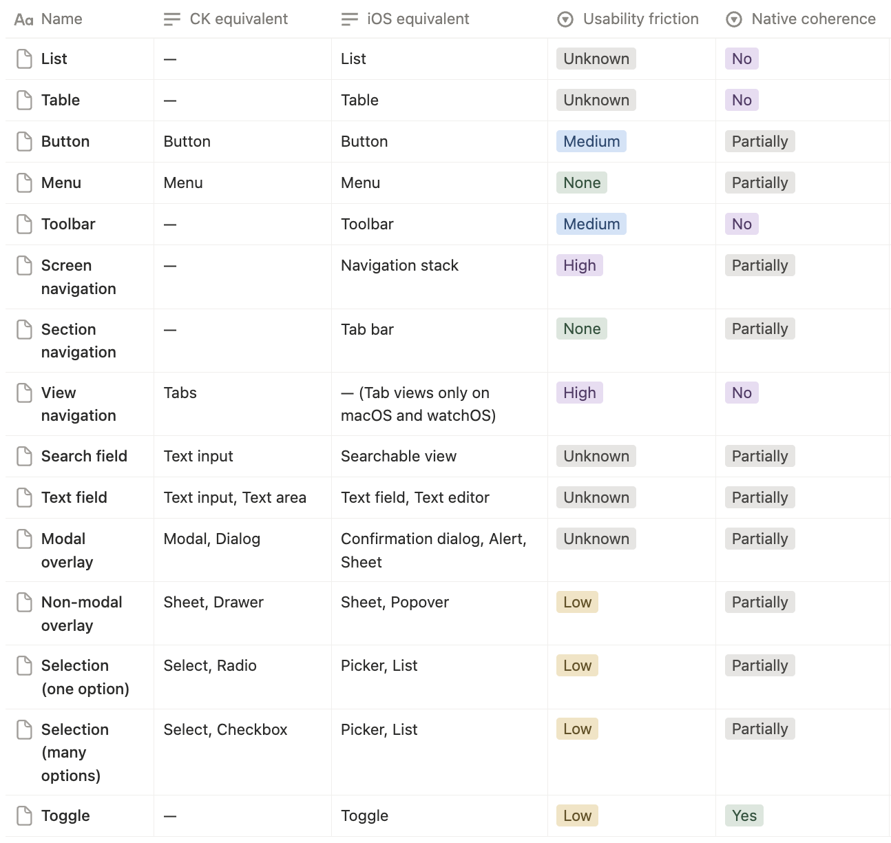
I've found that native components are often quicker to implement and provide better user experiences because they match user expectations for the platform. My prototypes confirmed that many Construct Kit components could be replaced or adapted with native alternatives, but sometimes designs get in the way of being able to do so. In cases like this, coaching designers to think in platform-native patterns is critical.
Layout and organisation
- Lists, although standardised on iOS, don't exist in Construct Kit, and use custom implementations almost every time
- Tables are not used anywhere in Ignite's apps, but iOS has a native table component that could be leveraged for data-heavy screens
Menus and actions
- All buttons in the Ignite apps are custom—iOS has native button styles that could be adapted to match brand styles, and provide better affordances than custom buttons
- Menus are custom implementations, but iOS has native menu components that provide better accessibility and interaction patterns, and fit in with platform conventions
Navigation and search
- Back button labels on navigation bars are inconsistent with iOS conventions, leading to confusion
- Toolbars are rarely used to provide quick access to screen-wide actions, despite being a native pattern
- Search fields are not utilised natively on iOS, missing out on platform conventions
- By using iOS 26's native tab bar instead of our custom implementation, we could delete ~461 lines of code
Presentation
- Action sheets could replace custom modals in many cases, providing better user experience and accessibility
- Popovers are not used, but could be leveraged for contextual actions on iPad
- Native sheets could replace custom implementations, providing consistent toolbars and gestures
Selection and input
- Pickers could replace custom dropdowns, providing better accessibility and platform coherence
- Segmented controls could replace custom toggle groups, improving usability
- Text fields could be standardised on native implementations, improving input handling and accessibility
- Native toggles are already being used but could be styled to better match brand colors
Status
- Rating indicators could use native star ratings, reducing custom code and improving platform coherence
Scaling the change through coaching
The biggest barrier to platform-native design isn't technical—it's helping designers move away from "lifting and shifting" web patterns to platform-first thinking. I've committed to coaching our designers on the most common design critique issues. Recently, I delivered a talk on navigation patterns that has already shifted how designers approach mobile navigation.
Teaching the tree structure of native navigation
The most impactful intervention so far has been a talk explaining why web navigation patterns fail on native platforms:
The core concept
- Web apps navigate via hyperlinks—you can jump from anywhere to anywhere (mesh network)
- Native apps navigate hierarchically—you push down branches and pop back up (tree structure)
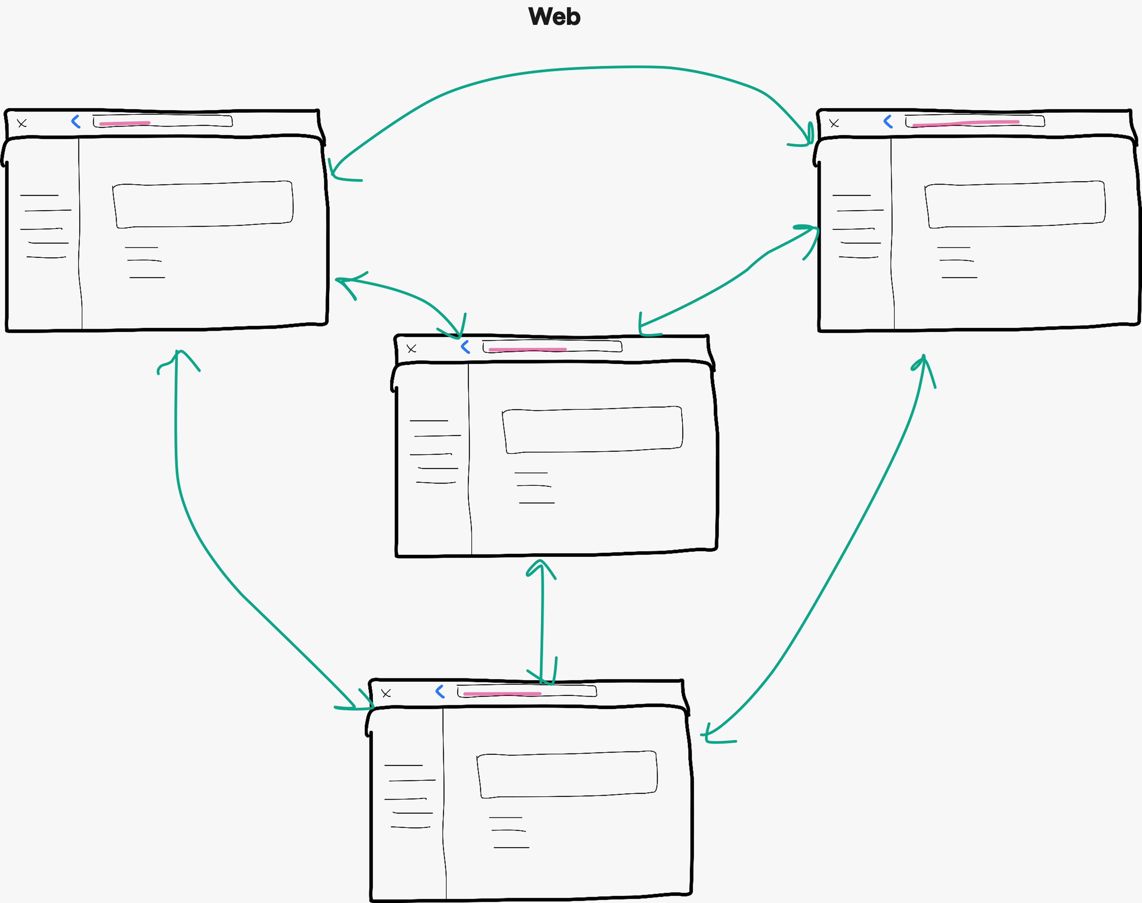
Why this matters
Designers trained on web apps instinctively create deep-linked shortcuts (e.g., home screen → detailed property view 3 levels deep). This works on web but breaks on mobile because users lose the "back" trail and can't navigate up the hierarchy.
Real example from critique
A designer proposed a shortcut from the listing campaign screen to the campaign management view by using a direct link, jumping from one tab to another. This would have left users confused and changed how back navigation works. By restructuring as hierarchical navigation, we maintained orientation and avoided confusion.
This talk became my most-requested 1:1 topic because it solves design critique issues at the root, helping designers think in platform-native structures rather than patching over web patterns.
Impact on design quality
After coaching sessions, I've observed:
- Fewer navigation anti-patterns in design critiques
- Designers proactively asking "is this platform-appropriate?" before presenting
- More collaboration between designers and iOS/Android engineers early in the process
- Stronger rationale for design decisions grounded in platform conventions
What's next: Shipping Cinder Kit v2.0
Component migration strategy
Based on my audit, I will categorise components into three buckets:
- Deprecate and replace with native component: Retire custom components with native alternatives
- Create Cinder Kit variant: Components that need an Ignite version, where the native pattern can't be adapted and Construct Kit's version isn't suitable (or doesn't exist)
- Keep as-is: Platform-agnostic Construct Kit components that work well everywhere
I'm planning a phased rollout giving teams one major version to migrate:
- Phase 1: Mark deprecated components, publish migration guides
- Phase 2: Release v2.0 alongside v1.0, teams migrate on their timeline
- Phase 3: Remove deprecated components after 90%+ team adoption
Success metrics
I'll track:
- User task completion rates in usability tests comparing v1.0 vs v2.0 designs
- Platform and brand coherence scores from design critiques pre- and post-migration
- Component adoption rate using Figma's component analytics (what % of teams migrated to v2.0)
- Design critique quality (fewer platform-convention issues raised)
- Engineering effort (lines of code saved by using native components)
Lessons learned so far
Prototyping in code is better than prototyping in Figma for systems work
Learning SwiftUI is changing how I think about component APIs and what's realistic to build natively. It's making my proposals more credible with engineers and revealing constraints I would never have found in Figma. This investment in "learning the material" was the best decision I made.
Strategic change requires building belief, not just building components
The technical work (auditing components, prototyping alternatives) is a lengthy process, but straightforward. The hard work is coaching designers to think differently, addressing stakeholder concerns with data, and creating migration paths that respect team timelines. Change management is 80% of systems work.
Platform conventions exist for good reasons
When I was designing for Construct Kit, I found myself thinking we could cherry-pick the "best" patterns and use them consistently across every platform. I learned that consistency within a platform matters more than consistency across platforms—user familiarity is powerful, and fighting it creates friction.
As Paul Adams, Chief Product Officer at Intercom, says:
There are lots of different things at Intercom, and for any company, where the industry standard is exactly what you should do, because it’s how people expect your product to work. [Not] every single layer of what you do needs to be new, different, and better.